DESIGN & DEVELOPE
I started to create web pages back in 2000, at school. I can't say it was good designing, and I knew nothing about the user's needs, I just played with tags and was excited to create something that wasn't there before. In 2006 I started my studies for a diploma in interactive communication at Sapir College, where I learned to design and build from scratch websites. Unfortunately my focus was on Flash websites, and I can't show you my old projects. What I can do is show you some fun projects I started in the past few months (after hours), that combine both sides of web creation.
WEBPAGE DEVELOPMENT
Working as part of a big company means to collaborate with other designers and other developers. The challenge is to execute a cohesive product while collaborating with different departments.
Big and complex sites, usualy have a sets of rules and behaviores, in order to create continuite between different pages on the site. Wich usualy make it easer for developers. While one company uses "masterpages" (taht I had to ajusted and edite as needed), the other used JavaScript and css master files to set the rules of a single page. It gets interesting when a page has a unique design that bypass the constants global rules.
THE DESIGN STAGE
I've been designing web sites and landing pages for over 10 years. You may find here some new designs and old ones. In the last year I started to work with Adobe XD, that made this process simpler. Whenever I get a new brief, I gather all the client's insights and the information they can share. Then with an understanding of the visitor persona, I browse the web for similar websites, trying to understand the market. I would show around 3 options to the client and then refine the chosen option.
Mobile App design
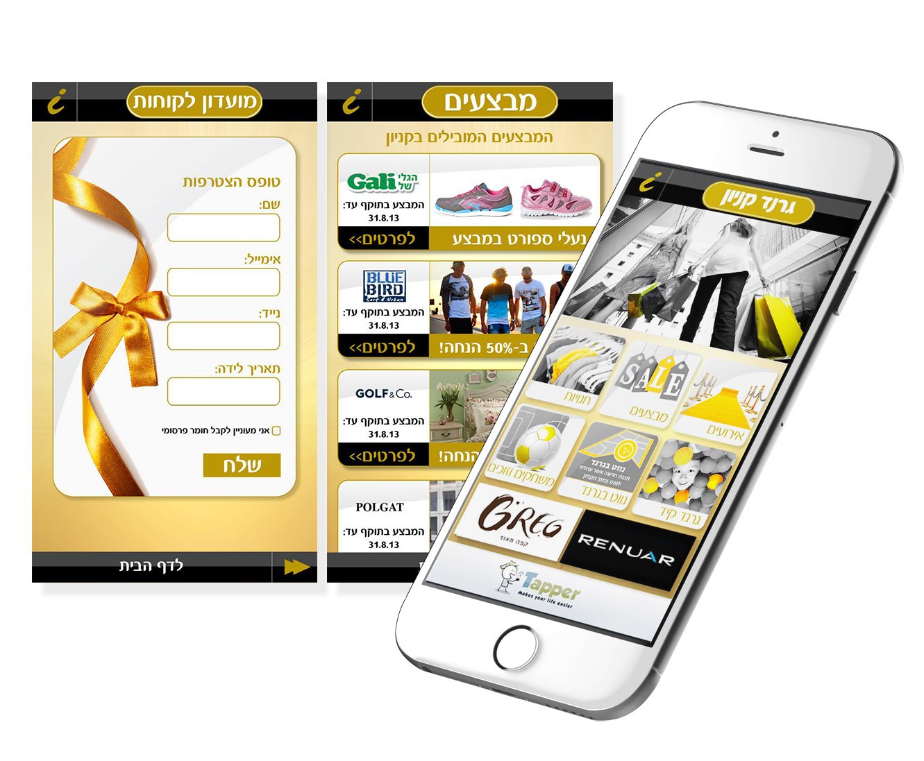
When I worked at "Sniper Marketing", back at 2013, I studyed about mobile design, and designed my first app. Since then I created over the years over 800 responcive adaptetions both designed and developed. Keeping the gide lines for "My Ofer" brand back in 2013, considering the developer needs, I designed this mobile app for the Grand Canyon Haifa mall.


